Makeover Monday: The Gender Pay Gap in England's Schools
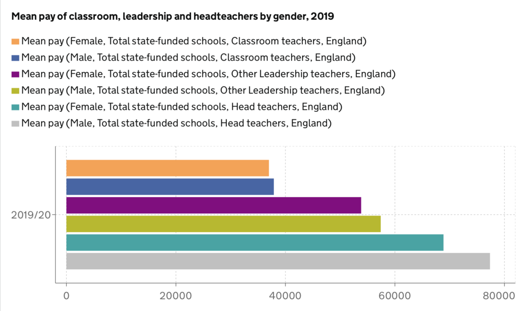
In September 2020 the UK government’s statistics department published data they collected surveying teachers at England’s state funded schools as part of the School Workforce Census. The challenge for Makeover Monday 2020 week 37 was to redesign a bar chart that accompanied this report, which summarised the mean pay of male and female teachers in various roles.
 The original vis. Source.
After studying this for a while, I realised that the gap between the mean wage of men and women increases as roles become more senior. This bar chart makes this difficult to see at first glance because every bar is a different colour. There is nothing to obviously indicate which bars refer to males and which refer to females. Likewise, there is nothing on the visualisation itself indicate which bars refer to the same roles - you have to refer to the legend. Thus, it is entirely possible to glance at this vis and have no impression at all of the worrying trend hidden within the data.
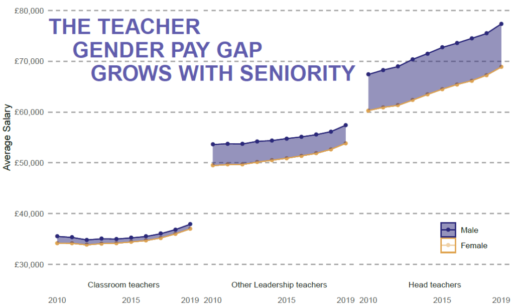
I thought the use of area would be a good way to convey the differing magnitude of the gap between males and females in different roles. To incorporate this, I chose to also use time data in my visualisation. To convey the difference between the sexes, I used dark blue for males and orange for females. I chose to fill the gap between men and women’s earnings with a transparent blue, to try and emphasise that the gap was in favour of men.
 My redesign of the bar chart as a faceted line graph, with shaded areas emphasising the gap between male and female earnings.
This was my first time using the geom_ribbon() function. It does not, in its default options, have a way to highlight the difference between two lines. I had to create a new column with the lowest possible value (i.e. the female value) for every time point and job position, and use this as the lower limit for the ribbon. You can find the code on my Github at this link.
I also added a large title in the same colour as the shaded areas, to try and emphasise that these areas were what I wanted the viewer to pay attention to. The title is important to emphasise that the three facets represent different levels of seniority, that increase from left to right. To learn this without the title, you would need to refer to the facet labels at the bottom of the graph.
Of course, the best part of these challenges is the ability to learn from and be inspired by others who took on the same task! One thing that, in hindsight, I could have added to my vis was some kind of quantification. Although I think the trend is clear, an interested viewer may ask: by how much are male head teachers paid than female headteachers? Given that I only present the y-axis once (on the very left hand side), this would be very difficult to read off! This vis by @infolabUK did a good job of including the % difference in earnings between men and women without cluttering up their chart.

To take this to the next level, @DMContente had a gorgeous interactive vis. As well as taking a somewhat similar approach to myself in faceting the chart and emphasising the differences in the wages of men and women in a single role, she added additional interactivity for the interested viewer. This allowed you to find out the absolute and percentage gap between male and female teachers in a given role in a given year. This visualisation definitely makes me want to play about with Tableau at some point! View @DMContente’s Tableau dashboard here.
I am always in awe of just how pretty a lot of other people’s visualisations are when compared to mine. Something I’ve noticed is that people don’t always choose white backgrounds, and sometimes this can be very effective in making a vis stand out and look professional (although care definitely needs to be taken!). I also see a lot of sectioning off plots so there are different sections for text description and charts. I have the tendency to want to slap a big title in some of the empty white space, but sectioning may be more aesthetically pleasing (and let me include more info!). I also want to experiment with different fonts. A lot to think about for my next challenge. Do, learn, and improve!