Tidy Tuesday: AKC Dog Breed Characteristics
How could I not do a Tidy Tuesday on dogs?! Even better: it has pictures of dogs. The data were obtained from the American Kennel Club and included URLs to lovely illustrations of each breed of dog that can be registered with the club. Details on various characteristics of the dog breeds, like their temperaments and appearances, were provided. Breeds were also ranked by number of registrations per year from 2013 to 2020.
I knew I wanted to incorporate the images into my visualisation. I have often admired visualisations that make use of images, but find the positioning of them some kind of black magic. So here I challenged myself to do to all the positioning of images using R. To achieve this I used the ggimage package.
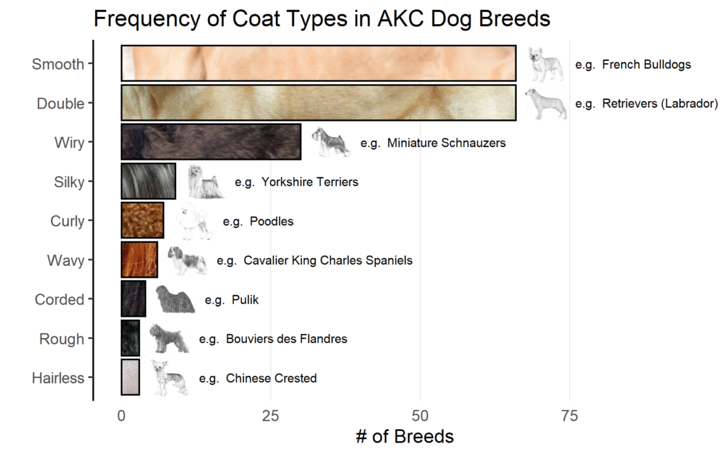
My visualisation is a simple bar chart of the number of breeds that have each coat type. I wanted to give an example breed for each coat type. I chose the breeds with the highest number of registrations in 2020 to increase the chances that viewers would be familiar with the example. Then, I placed the illustration of the example breed at the ends of the bar. For some extra context, I also filled the bars with an example image of the coat’s texture.

Positioning images is definitely easier when you are thinking in terms of an existing plot. Here, I knew I wanted the dogs to appear after the bars, so their x co-ordinates would be framed in terms of the coat type counts. ggimage magic takes care of the positioning along the discrete y axis. Code available here.
One of my favourite contributions by other participants was a table of the 2020 registration rankings by @WeAreRLadies. It’s simple, but I think that’s exactly the reason it looks so appealing. It also does a great job of displaying the lovely illustrations. I have never used the gt package before, but it’s definitely on my to-do list now!

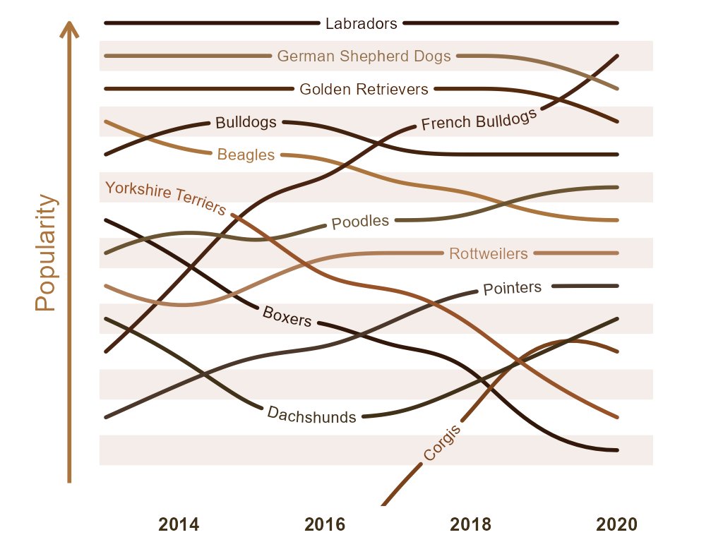
Lots of other participants also chose to focus on the registration ranking data. @dr_allancameron chose to look at trends in breed ranking over time. For this they used their own geomtextpath package which allows you to create curved text in ggplot2. I absolutely love the aesthetic of this plot, there’s something about having the name of the breed be part of the line that is really engaging. You can easily pick out interesting trends too, like the rise of the corgi or the fall of the Yorkshire terrier.

The magic people achieve in ggplot2 will never fail to amaze me!