TidyTuesday: Erasmus Destinations
Keeping with my current theme of geospatial data, I chose tackle the Erasmus mobility TidyTuesday data set from a few weeks back. The Erasmus program is an EU initiative which gives students the opportunity to spend some part of their degree studying in another country. The data set I visualised contains the sending and receiving countries of organisations that exchanged learners through Erasmus between 2014 and 2019. I used this data to make an interactive choropleth visualisation, which you can try at https://anailis.shinyapps.io/erasmus/.
My finished visualisation was a Shiny application that allows the user to select a country that participates in Erasmus on a map. Doing so changes the colouration of the map to show which countries received the most students from the selected nation.

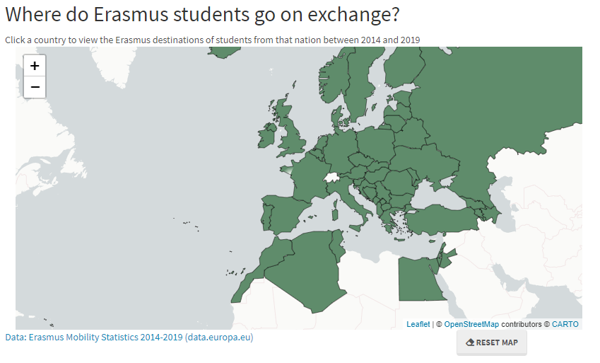
When you first load the map, it shows a map of the world. Countries participating in Erasmus are green with black borders, whereas non-participating countries are white with light grey borders. I chose this scheme to indicate give the user the context of the familiar world map, whilst also drawing their attention specifically to the relevant countries. Users can zoom in or out to help identify their country of interest.
Moving your mouse over the Erasmus participating countries causes the country’s name to appear under the cursor and changes the border to a light-grey colour. This highlighting was included to encourage the user to click on the visualisation.
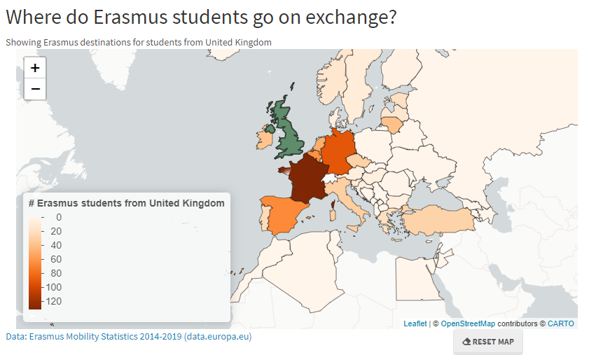
 Screenshot of the Shiny app when the United Kingdom is selected.
When a country is selected by clicking anywhere on that country, it stays green but its border becomes thicker to indicate that it has been selected. The colours of other Erasmus participating countries change to display a heat map. A legend for the heat map appears in the bottom left hand corner. Mousing over these countries displays the country name and the number of students from the selected country that visited. Selecting another country will show the heatmap for students sent from the newly selected country. Alternatively, the map can be reset to its base state using the RESET MAP button underneath it.
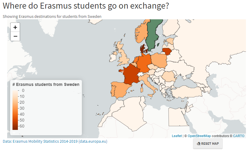
In this post I have included two examples: the heatmaps for the United Kingdom and Sweden. From the UK heatmap, we can see that most students studying in the UK go to France, Germany, or Spain. These countries are also popular with Swedish students, but not as much as neighbouring Denmark, which is the most frequently visited country by Swedish Erasmus participants. This demonstrates how this visualisation can be used to compare and contrast the Erasmus destinations of students from different countries.
 Screenshot of Shiny app when Sweden is selected.
I challenge you to have a click around and see if you can find any interesting trends!
Note, as this is just a quick visualisation for fun I didn’t do any optimising for mobile, so use on desktop is preferable.